
csXGraph Version 2.0 - Online Manual
Introduction
These instructions are also available in pdf format. We recommend using the PDF version if a printable manual is required.
This is an ActiveX / OCX control that generates 2D bar charts, pie charts, simple line graphs and scatter diagrams. The resulting graph can displayed in the control, saved to file or copied to the Windows clipboard. The image can be exported as binary data in the form of a variant array making it suitable for use in a server side application such as an ASP script. Exported images can be in BMP, PNG, JPG, GIF or PCX format. PNG and GIF images support a transparent colour.
A free trial version of csXGraph is available. Graphs produced using this trial version contain a line of text at the top to indicate that they use the trial version. This is the only difference in functionality between the trial and full versions. This means that you can fully test if this control is suitable for your application before considering whether to license the full version.
Version 2.0 is supplied as both 32 bit and 64 bit. Full details of the files installed are described in Section 8 of these instructions. Please note that support for Windows 2000 and earlier has been removed from Version 2.0.
Using these Instructions
These instructions are divided into a number of sections covering the different types of graph. There are quick links to each section. A full Table of Contents is available and an index listing all commands in alphabetical order is included at the back for easy reference.
The component has a large number of properties that control the appearance of the graphs. When these properties are not specified in code they will take their default values and these defaults have been selected with the aim of producing a legible graph with the minimum of code.
Click on one of the links below to go directly to the section of interest:
Table of Contents
- 1. Pie Charts
- 1.1. Pie Chart Methods
- 1.2. Pie Chart Properties
- 1.3. Pie Chart Example
- 2. Bar Charts
- 2.1. Bar Chart Methods
- 2.2. Bar Chart Properties
- 2.3. Bar Chart Example
- 3. Line Graphs
- 3.1. Line Graph Methods
- 3.2. Line Graph Properties
- 3.3. Line Graph Example
- 4. Stacked Bar Charts
- 4.1. Stacked Bar Chart Methods
- 4.2. Stacked Bar Chart Properties
- 4.3. Stacked Bar Chart Example
- 5. Miscellaneous Settings
- 5.1. Properties to Define the Axes of Bar and Line Graphs
- 5.2. Legend Properties
- 5.3. Setting the Size of a Graph
- 5.4. Text and Font Properties
- 5.5. Standard Text and Annotations
- 5.5.1. Labels (Axis Values and Pie Chart Labels)
- 5.5.2. Title Text
- 5.5.3. The Prefix, Suffix and ShowSeparator Properties
- 5.6. Decimal Places
- 5.7. Adding Extra Text and Annotations to a Graph
- 5.7.1. AddText and AddExtraLine
- 5.7.2. Adding Text to Line Graphs
- 5.8. Substituting Axis Labels
- 5.9. Plotting Dates or Times
- 5.10. Displaying Percentages on Bar and Pie Charts
- 5.12. Random Colours
- 5.13. Miscellaneous Methods and Properties
- 5.13.1. Miscellaneous Methods
- 5.13.2. Miscellaneous Properties
- 5.14. Properties Returning Information About the Graph
- 6. Plotting Lines on Bar Charts
- 6.1. Bar Chart Example With a Plotted Line
- 7. Events
- 8. Installation
- 8.1. Using csXGraph in Visual Basic
- 8.2. Using csXGraph in Delphi
- 8.3. Using csXGraph in VB.NET
- 8.4. Events in VB.NET
- 8.5. Replacing the Trial with the Full Version in VB.NET
- 8.6. Deploying a Compiled Application
- 9. Using csXGraph Client Side in a Browser
- 9.1. The Licence File
- 9.2. Distributing the OCX File
- 9.3. Calling the Control
- 9.4. Security Settings in Internet Explorer
- 9.5. Javascript Example
- 9.6. Events in Javascript
- 9.6.1. The older method of defining Javascript events
- 10. System Requirements
- 11. Revision History
- 12. Other Products from Chestysoft
- 13. Alphabetical List of Commands
1. Pie Charts
Pie charts are drawn by adding data items using the AddData method. Each data item has a name, a value and a colour and each item will be shown as a separate sector on the pie chart. An optional legend can be generated showing the names and colours of each data item. Properties are available to specify the position of the pie and its diameter, as well as options for showing the data values and/or the labels (data item names). Note that if the pie sectors are small these text annotations may interfere with each other. The data items are shown anticlockwise in the order that they are added and the starting point is defined by the StartAngle property.
The ClearData method is usually called before adding data in order to remove data from any previously drawn graph. The GraphType property must be set to 0 to generate a pie chart. Finally, the graph is drawn into the control by calling the DrawGraph method.
The values can be displayed as percentages of the total by setting ShowPercent to true.
1.1. Pie Chart Methods
AddData (Name As String, Value As Double, Colour As OLE_COLOR) - Each data item in a pie chart has a Name - which may be displayed on the chart or in the legend, a Value - which must be a positive numeric value, and a Colour. A call to AddData will add these values for drawing a single pie chart segment. A separate call to AddData must be made for each data item in the chart.
ClearData ( ) - Removes all data items already added. Call this before AddData when generating a new chart. It does not reset property values to their defaults.
DrawGraph ( ) - This method generates the graph. The type of graph generated depends on the value of the GraphType property which must be 0 to produce a pie chart.
1.2. Pie Chart Properties
The properties described here are specific to pie charts. The default values are in brackets.
CenterX - Long. X-coordinate of the centre of the pie, measured from the left. (175)
CenterY - Long. Y-coordinate of the centre of the pie, measured from the top. (150)
PieDia - Long. Diameter of the pie in pixels. (200)
StartAngle - Single. Position of the first pie segment measured in degrees, anticlockwise, with zero at the bottom of the circle. (0)
Offset - Long. The spacing between the labels and the pie chart edge. It does not represent any specific units but a larger value gives a larger spacing. (10)
ShowPercent - Boolean. When true the values are shown as percentages of the total. When false the values entered in AddData are displayed. (false)
GraphType - Enumeration. This specifies the type of graph generated. Set to 0 to display a pie chart. (1)
There are other properties listed in other sections of these instructions that can also be used to control the appearance of a pie chart.
1.3. Pie Chart Example
The following code fragment shows how a pie chart can be drawn using Visual Basic.
Chart.ClearData
Chart.Title = "Pie Chart Example"
Chart.AddData "Item 1", 17, vbRed
Chart.AddData "Item 2", 28, vbGreen
Chart.AddData "Item 3", 5, vbBlue
Chart.GraphType = dgtPie
Chart.DrawGraph
In this example all the data values are hard coded and the default property values are used. The VB colour constants are used for the colour values and the enumeration constant is used for the value of GraphType.
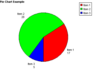
The Title property has been set, with the title using the default settings for font and position. If this code is used with the trial version of the component the trial text will interfere with the default position of the title. In this case the TitleX or TitleY properties could be changed to reposition the title.
2. Bar Charts
Bar charts are drawn by adding data items using the AddData method. Each data item has a name, a value and a colour and each item will be shown as a separate bar on the bar chart. An optional legend can be generated showing the names and colours of each data item. A large number of properties are available to control the size, shape and appearance of bar charts. These include options for displaying negative values.
The ClearData method is usually called before adding data in order to remove data from any previously drawn graph. The GraphType property must be set to 1 or 2 to generate a bar chart. When GraphType is 1 the bars are shown vertically, when 2 the bars are shown horizontally. Finally, the graph is drawn into the control by calling the DrawGraph method.
The values can be displayed as percentages of the total by setting ShowPercent to true.
An optional linear regression trend line can be shown on bar charts by setting the ShowTrendLine property to true.
2.1. Bar Chart Methods
AddData (Name As String, Value As Double, Colour As OLE_COLOR) - Each data item in a bar chart has a Name - which may be displayed under the bar or in the legend, a Value - which must be a numeric value, and a Colour. A call to AddData will add these values for drawing a single bar. A separate call to AddData must be made for each bar in the chart.
ClearData ( ) - Removes all data items already added. Call this before AddData when generating a new chart. It does not reset property values to their defaults.
DrawGraph ( ) - This method generates the graph. The type of graph generated depends on the value of the GraphType property which must be 1 to produce a bar chart with vertical bars and 2 to produce a bar chart with horizontal bars.
2.2. Bar Chart Properties
BarWidth - Long. Width of each bar in pixels. Auto calibrate if zero. (0)
BarGap - Long. Space between bars in pixels. Auto calibrate if zero. (0)
LabelVertical - Boolean. Controls the orientation of the names of each data item describing each bar. This applies to vertical bars only. (false)
ShowBarTotal - Boolean. When true the data value will be shown above each bar for vertical bars and to the right of horizontal bars. (false)
BarTotalVertical - Boolean. Controls the orientation of the data values above each bar. (false)
ShowTotalIfZero - Boolean. When this is false the data values will not be shown if they are zero. (true)
The following properties control the trend line.
ShowTrendLine - Boolean. When true a linear regression trend line will be drawn on the bar chart. (false)
TrendLineColor - OLE_COLOR. The colour of the trend line. (black)
TrendLineWidth - Long. The thickness of the trend line, in pixels. (1)
TrendLineName - String. The name that will appear in the legend to describe the trend line. If this is an empty string the trend line will not be displayed in the legend. (null)
There are a large number of properties that can be used with bar charts that are described in other sections of these instructions.
As of version 1.6 of csXGraph it is possible to plot lines onto bar charts. This is described in Section 6 of these instructions.
2.3. Bar Chart Example
The following code fragment shows how a bar chart can be drawn using Visual Basic.
Chart.ClearData
Chart.Title = "Bar Chart Example"
Chart.TitleX = 120
Chart.ShowBarTotal = True
Chart.AddData "Item 1", 17, vbRed
Chart.AddData "Item 2", 28, vbGreen
Chart.AddData "Item 3", 5, vbBlue
Chart.GraphType = dgtVBar
Chart.DrawGraph
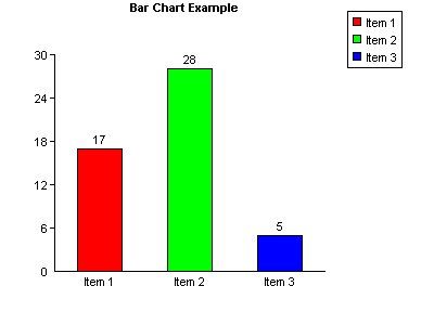
In this example all the data values are hard coded and the default property values for the axes are used.
The Title property has been set and TitleX has been used to move the title text into a central position. ShowBarTotal is true which causes the value of each data item to appear above each bar.
Refer to Section 5 for the full range of properties that are shared with other graph types, such as setting the axes, positioning the legend and additional annotation.
3. Line Graphs
The line graphs drawn by csXGraph are simple 2-D graphs on a single set of X and Y axes. Multiple lines can be displayed on one graph if the lines are separate colours. By default the points are hidden and the lines joining the points are shown. Changing the PointStyle property will make the points appear and setting ShowLine to false will hide the graph lines and this arrangement can be used to draw a type of scatter diagram.
The ClearData method is usually called before adding points in order to remove data from any previously drawn graph. The GraphType property must be set to 3 to generate a bar chart. Finally, the graph is drawn into the control by calling the DrawGraph method.
3.1. Line Graph Methods
AddPoint (X As Double, Y As Double, Colour As OLE_COLOR, LineName As String) - This command adds a point to be plotted on a line graph. X and Y are the coordinates of the point, which must be numeric values. Colour is the colour of the line. LineName is the string that will be displayed if a legend is used. When the graph is plotted all the points that are the same colour will be joined by straight lines going from point to point in the order they were added.
A separate call to AddPoint must be made for each point on the graph.
Example code for Visual Basic:
Chart.AddPoint 0, 0, vbRed, Red Line
Chart.AddPoint 30, 30, vbRed,
Chart.AddPoint 0, 0, vbGreen, Green Line
Chart.AddPoint 30, 20, vbGreen,
This would draw two lines, one in red and the other in green. Note that the name used in the legend is the first value of LineName for each colour so an empty string can be used for the remaining entries.
ClearData ( ) - Removes all data items already added. Call this before AddPoint when generating a new graph. It does not reset property values to their defaults.
DrawGraph ( ) - This method generates the graph. The type of graph generated depends on the value of the GraphType property which must be 3 to produce a line graph.
3.2. Line Graph Properties
LineWidth - Long. Width of the graph lines in pixels. (1)
ShowLine - Boolean. Determines whether points are shown joined together. Set to false for a scatter diagram. (true)
PointStyle - Enumeration. Determines the type of point that will be drawn. 0 - none, 1 - dot, 2 - circle, 3 - diagonal cross, 4 - vertical cross. This property applies to all the graph lines. (0)
PointSize - Long. Size of the plotted point. (2)
XValuesVertical - Boolean. Determines the orientation of the x-axis values. When true, the values are written up the page from bottom to top. (true)
HideHGrid - Boolean. Hides the horizontal grid lines, when ShowGrid is true. (false)
HideVGrid - Boolean. Hides the vertical grid lines, when ShowGrid is true. (false)
PrefixX - String. This value will be shown in front of the numeric values on the x-axis. (null)
PrefixY - String. This value will be shown in front of the numeric values on the y-axis. (null)
SuffixX - String. This value will be shown after the numeric values on the x-axis. (null)
SuffixY - String. This value will be shown after the numeric values on the y-axis. (null)
ShowSeparatorX - Boolean. When true, commas will be used to separate thousands on the x-axis. (false)
ShowSeparatorY - Boolean. When true, commas will be used to separate thousands on the y-axis. (false)
There are a large number of properties that can be used with line graphs that are described in other sections of these instructions.
3.3. Line Graph Example
The following code fragment shows how a line graph can be drawn using Visual Basic.
Chart.ClearData
Chart.ShowGrid = True
Chart.YAxisText = "Y Axis"
Chart.XAxisText = "X Axis"
Chart.AxisTextFont.Bold = True
Chart.AddPoint 0, 0, vbRed, "Red Line"
Chart.AddPoint 30, 30, vbRed, ""
Chart.AddPoint 0, 0, vbGreen, "Green Line"
Chart.AddPoint 30, 20, vbGreen, ""
Chart.GraphType = dgtLine
Chart.DrawGraph
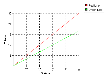
In this example all the data values are hard coded and the default property values are used for the axes.
The grid is displayed by setting ShowGrid to true. This uses the default style and colour settings. The axes are labelled by setting the XAxisText and YAxisText properties and the text for these labels has been specified as bold.
4. Stacked Bar Charts
Stacked bar charts are a variation of bar chart that allow the data to be grouped. The bars that make up a group are shown end on or "stacked". Data is added to stacked bar charts using the AddGroupedData method. The GraphType property is set to 4 to generate a stacked bar chart with vertical bars and 5 for a chart with horizontal bars.
4.1. Stacked Bar Chart Methods
AddGroupedData (Group As String, Name As String, Value As Double, Colour As OLE_COLOR) - Each data item belongs to a Group, and all items belonging to a Group will appear as part of the same bar. The Group may be shown under each bar. Each data item has a Name, which is a string, and this may be displayed in the legend. Value must be a positive number. Colour is the OLE_COLOR value of the colour representing the data item. Data items with the same name should have the same colour although no checks are made to enforce this.
A separate call to AddGroupedData must be made for each data item in the graph.
Example code for Visual Basic:
Chart.AddGroupedData "January", "Red things", 17, vbRed
Chart.AddGroupedData "January", "Blue things", 28, vbBlue
Chart.AddGroupedData "February", "Red things", 5, vbRed
Chart.AddGroupedData "February", "Blue things", 14, vbBlue
This would add the data to draw two bars, one marked "January", and the other marked "February". Each bar would be split into two areas, one red and the other blue. If the legend is to be displayed it would have a red square marked "Red things" and a blue square marked "Blue things".
4.2. Stacked Bar Chart Properties
The properties used for ordinary bar charts are also used by stacked bar charts, so refer to the section on bar chart properties for a description.
The properties which are unique to stacked bar charts control how the numeric values are shown for each data item, if they are to be displayed. These properties are described below.
ShowStackedValue - Boolean. When true each data item will have its value displayed next to the bar or inside the bar, depending on the value of StackedTextAlign. The following properties define the font appearance. (false)
StackedTextFont - IFontDisp. The font properties used for the data values. (Arial, size 8)
StackedTextBGColor - OLE_COLOR. Background colour of the data value text. (white)
StackedTextColor - OLE_COLOR. Colour of the data value text. (white)
StackedTextTransparent - Boolean. When true the data values have a transparent background. (true)
StackedTextAlign - Enumeration. Determines the position and orientation of the data value relative to the bars. 0 - Centre Horizontal, 1 - Centre Vertical, 2 - Left Horizontal, 3 - Left Vertical, 4 - Right Horizontal, 5 - Right Vertical. (0)
The horizontal values mean the text reads from left to right, the vertical values read from bottom to top and the centre values show the text inside the bar. Note that when GraphType is set to 5 and the bars are horizontal the data values will only be shown horizontally and an alignment of left or right means above or below respectively.
4.3. Stacked Bar Chart Example
The following code fragment shows how a stacked bar chart can be drawn using Visual Basic.
Chart.ClearData
Chart.ShowBarTotal = True
Chart.ShowStackedValue = True
Chart.StackedTextAlign = 4
Chart.AddGroupedData "January", "Red things", 17, vbRed
Chart.AddGroupedData "January", "Blue things", 28, vbBlue
Chart.AddGroupedData "February", "Red things", 5, vbRed
Chart.AddGroupedData "February", "Blue things", 14, vbBlue
Chart.GraphType = dgtVStackedBar
Chart.DrawGraph
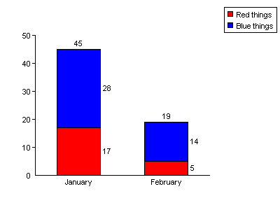
In this example all the data values are hard coded and the default property values are used for the axes.
The numbers above and to the side of the bars are not shown by default. The total above the bar is shown because ShowBarTotal has been set to true and the individual values are shown because ShowStackedValue is true. StackedTextAlign specifies where the values are displayed relative to the bars.
5. Miscellaneous Settings
5.1. Properties to Define the Axes of Bar and Line Graphs
The following properties apply to graphs with axes, such as bar charts and line graphs. They set the length of each axis including any negative amount, the position of the graph origin and define the way each axis is calibrated.
Default property values are shown in brackets.
OriginX - Long. X coordinate of the origin, measured from the left of the image. (50)
OriginY - Long. Y coordinate of the origin, measured from the top of the image. (250)
MaxX - Long. Length of the x-axis in pixels. (250)
MaxY - Long. Length of the y-axis in pixels. (200)
XAxisNegative - Long. Length of the negative x-axis in pixels. The length of the positive x-axis will be (MaxX - XAxisNegative). Only line graphs can have a negative x-axis. (0)
YAxisNegative - Long. Length of the negative y-axis in pixels. The length of the positive y-axis will be (MaxY - YAxisNegative). (0)
XTop - Double. Maximum value on the x-axis. Auto calibrate if zero. (0)
XGrad - Double. Distance between the graduations on the x-axis as plotted values, not pixels. Auto calibrate if zero. (0)
YTop - Double. Maximum value on the y-axis. Auto calibrate if zero. (0)
YGrad - Double. Distance between the graduations on the y-axis as plotted values, not pixels. Auto calibrate if zero. (0)
XOffset - Double, positive value only. The starting value on the x-axis. Set this when the range of values on the x-axis do not start from zero. (0)
YOffset - Double, positive value only. The starting value on the y-axis. Set this when the range of values on the y-axis do not start from zero. (0)
ShowGrid - Boolean. When true, grid lines will be drawn on the graph level with the graduations on the axes. For bar charts, only the horizontal grid lines are shown. (false)
GridStyle - Enumeration. Determines the line type used for the grid lines. 0 - solid, 1 - dot, 2 - dash. (1)
GridColor - OLE_COLOR. Colour of the grid lines. (black)
XMarkSize - Long. The length of the graduation mark on the x-axis of a line graph. (4)
YMarkSize - Long. The length of the graduation mark on the y-axis. (4)
PlotAreaColor - OLE_COLOR. Background colour of the area enclosed by the axes. (white)
ShowPlotBorder - Boolean. When true, the plot area is enclosed by a rectangular border the colour of GraphPen. (false)
XAxisText - String. Label to display along the x-axis. (null)
YAxisText - String. Label to display along the y-axis. (null)
AxisTextFont - IFontDisp. The font proprties to use for the axis text. (Arial, size 8)
AxisTextBGColor - OLE_COLOR. Colour of the background to the axis text. (white)
AxisTextColor - OLE_COLOR. Colour of the axis text. (black)
AxisTextTransparent - Boolean. When true the axis text will have a transparent background. (false)
5.2. Legend Properties
The following properties control the appearance and position of the legend. They apply to all types of graph.
LegendX - Long. X-coordinate of the legend box. (320)
LegendY - Long. Y-coordinate of the legend box. (20)
LegendAlign - Enumeration. This specifies the part of the legend box to which LegendX and LegendY measure. 0 - Top Left, 1 - Top Centre, 2 - Top Right, 3 - Middle Left, 4 - Middle, 5 - Middle Right, 6 - Bottom Left, 7 - Bottom Centre, 8 - Bottom Right. (0)
LegendVertical - Boolean. When true the legend is a vertical list, when false it is a horizontal list. (true)
LegendFont - IFontDisp. Font properties for the legend text. (Arial, size 8)
LegendBGColor - OLE_COLOR. Background colour of the legend area. (white)
LegendColor - OLE_COLOR. Colour of the text and lines in the legend area. (black)
Square - Long. Size of the coloured square in the legend box. (8)
Padding - Long. Spacing inside the legend box. (5)
ShowLegend - Boolean. Determines whether the legend is displayed. (true)
ShowLegendBox - Boolean. Determines whether the rectangle is displayed around the legend. (true)
LegendInvert - Boolean. The legend entries are usually shown in the order the data is entered. Setting LegendInvert to true reverses the order. Does not apply to line graphs. (false)
LegendHideEmptyNames - Boolean. Set to true to prevent legend entries from displaying when the label is an empty string. This option allows empty bars to be added to bar charts as spacers without affecting the legend. In line graphs it can allow a line to be hidden from the legend if no string is used in the AddPoint command. (false)
It is possible to replace the automatically generated legend entries with customised entries by setting CustomLegend to true and adding pairs of text and colour values with the AddCustomLegend method.
CustomLegend - Boolean. Set to true to use the custom legend entries added by AddCustomLegend instead of the automatically generated entries. (false)
AddCustomLegend (Value, Colour - Value) is the text label to use in the legend and Colour is the colour for the legend entry as an OLE_COLOR. This method must be called for each entry to be added to a custom legend. These entries will be used when CustomLegend is true.
ClearCustomLegend - Method to clear any entries previously added using AddCustomLegend.
5.3. Setting the Size of a Graph
The size of the image produced by csXGraph is defined by the Width and Height properties.
Width - Long. Width of the control and the graph image in pixels. Default = 400.
Height - Long. Height of the control and the graph image in pixels. Default = 300.
There are separate properties to cover the size and position of each feature on the graph and so other properties will need to be changed in addition to width and height to produce a different size of graph.
For a pie chart the pie diameter and position are determined by PieDia, CenterX and CenterY. For other types of graph the plotted area is located by OriginX and OriginY. The overall length of the axes is defined by MaxX and MaxY.
On all types of graph the legend is located by LegendX and LegendY.
In some programming environments the form is not measured in pixels. For example, in Visual Basic the default unit of measurement is the twip. If the form is measured in twips the Width and Height will show their twip values but when the graph is drawn, csXGraph will use the pixel equivalents. We would recommend setting the form's ScaleMode property to pixels to avoid confusion, especially if the control dimensions are to be set programmatically.
5.4. Text and Font Properties
There are 6 different text items that can be displayed on the graph image. Each has its own font and properties. The font is defined as an IFontDisp data type and in some visual development environments, such as Visual Basic, a font property page will be displayed at design time to allow easy changes to the properties. Each text type also has a Boolean property for background transparency, a colour and a background colour. If the text is transparent the background colour is ignored. The 6 font properties are:
LabelFont - This is used for the text around pie charts, the labelling of axes in bar charts and line graphs and the text labels and values associated with bar charts.
LegendFont - This is the text that appears inside the legend. It does not have a separate background colour because it always uses the legend background colour.
TitleFont - The title is a single piece of text that can be placed anywhere. This text is bold by default.
AxisTextFont - The axis text are two pieces of text (one for each axis) that can be specified to label the axes on bar charts and line graphs.
TextFont - This is the font used by additional text added using the AddText method. Each item of text can only use a single line, but there is no limit to the number of items. They must all have the same font properties. This text that is transparent by default.
LineGraphTextFont This is the font used by additional text added using the AddLineGraphText method.
StackedTextFont This is the font used when stacked bar charts have the data values displayed after setting ShowStackedValue to true.
The IFontDisp is an ActiveX data type and it contains a number of sub properties including Name and Size and the Boolean properties Bold, Italic, Strikethrough and Underline. Here is an example of setting some font properties in Visual Basic.
Chart.TitleFont.Name = "Courier New"
Chart.TitleFont.Size = 10
Chart.TitleFont.Bold = False
5.5. Standard Text and Annotations
This section describes the properties that control the standard text that annotates all the types of graph.
5.5.1. Labels (Axis Values and Pie Chart Labels)
The following font properties apply to the values shown along the axes of bar charts and line graphs, as well as the annotation labelling each pie chart sector.
LabelFont - IFontDisp. Font used for the labels. (Arial, Size 8)
LabelBGColor - OLE_COLOR. Background colour of the label text. (white)
LabelColor - OLE_COLOR. Colour of the label text. (black)
LabelTransparent - Boolean. Determines whether the label backgrounds are transparent. (false)
The following properties determine whether the labels are displayed.
ShowNumbers - Boolean. Determines whether numerical values are shown on the axes for bar and line graphs, or next to the sectors on pie charts. (true)
ShowLabel - Boolean. Determines whether the names of each data item are displayed on bar and pie charts. (true)
5.5.2. Title Text
A line of text can be added as a title. By default this is drawn at the top left corner of the image in bold but it can be positioned as required and the font can be specified.
Title - String. Single line of text to be displayed if required. The properties controlling the font and position are described below. (null)
TitleX - Long. X-coordinate of the title text alignment point. (0)
TitleY - Long. Y-coordinate of the title text alignment point. (0)
TitleFont - IFontDisp. Font properties to use for the title. (Arial, Size 8, Bold)
TitleBGColor - OLE_COLOR. Background colour of the title text. (white)
TitleColor - OLE_COLOR. Colour of the title text. (black)
TitleTransparent - Boolean. Determines whether the title background is transparent. (false)
TitleTextAlign - Enumeration. This specifies the alignment point of the title text which is the position within the text string that is located by TitleX and TitleY. 0 - Top Left, 1 - Top Centre, 2 - Top Right, 3 - Baseline Left, 4 - Baseline Centre, 5 - Baseline Right, 6 - Bottom Left, 7 - Bottom Centre, 8 - Bottom Right. (0)
5.5.3. The Prefix, Suffix and ShowSeparator Properties
The properties described in this section control the formatting of numerical values on all types of graphs. The Prefix and Suffix allow strings or single characters to be added at the start or end of all values, allowing currency symbols or other units to be displayed. ShowSeparator toggles the display of the thousands separator symbol as defined in the regional settings.
Prefix - String. This value will be shown in front of all numeric values. It may be used to display currency symbols, for example. (null)
Suffix - String. This value will be added at the end of each numeric values. It may be used to display a units symbol. (null)
ShowSeparator - Boolean. When true, the numeric values will be formatted to separate thousands using the separator defined by the regional settings. This is usually a comma or a dot. (false)
In a line graph, these properties will be applied to values on both the x and y axes, which might not be required. Properties have been provided in the section on line graphs to allow a prefix, suffix or separator to be applied to a single axis.
5.6. Decimal Places
The number of decimal places displayed in each graph is specified by the Decimals property, which defaults to zero. This property must be set to a non-zero value for decimal places to show in plotted values.
Decimals - Integer. The number of decimal places shown for numeric values. To display a fixed number of decimal places prefix the value with a "-" sign. (0)
For example, to show currency values with 2 fixed decimal places, set Decimals to -2. This will display 2 decimal places with trailing zeroes where appropriate.
The symbol used for the decimal point will be taken from the regional settings.
5.7. Adding Extra Text and Annotations to a Graph
csXGraph contains functionality to add extra text and lines to the graph to provide customised annotation.
5.7.1. AddText and AddExtraLine
AddText and AddExtraLine will draw text and lines on any type of graph and these features are positioned using pixel coordinates, measured from the top left of the graph image.
AddText (Text As String, X, Y As Long, Angle As Single) - Text is the text string, X and Y are the coordinates measured from the top left of the graph image and Angle is the rotation angle of the text. This text has a number of font properties to define the style, size and colour. These are described below.
AddExtraLine (X1, Y1, X2, Y2, Thickness As Long, PenStyle As Enumeration, Colour As OLE_COLOR) - This adds a line to the graph. X1, Y1 are the coordinates of the starting point and X2, Y2 are the coordinates of the end point. Thickness is the line thickness in pixels where 0 or 1 both give a line of 1 pixel width. PenStyle is an enumeration defining the line type, 0 - solid, 1 - dot, 2 - dash. Colour is the colour of the line.
Each of the functions above can be called multiple times to display multiple text strings or lines.
The following properties define the font properties used by the AddText command. All the text drawn by AddText has the same properties.
TextFont - IFontDisp. Font for the extra text drawn using AddText. (Arial, size 8)
TextTransparent - Boolean. When true the extra text is has a transparent background. (false)
TextColor - OLE_COLOR. Colour of the extra text. (black)
TextBGColor - OLE_COLOR. Colour of the background to the extra text. (white)
5.7.2. Adding Text to Line Graphs
Text can be added to line graphs using the AddLineGraphText method and the text is positioned using the graph coordinates, making it easy to annotate the graph near the plotted points. Related properties give options for drawing a border around the text and a leader line to another point.
AddLineGraphText (Text As String, X, Y, Angle As Single) - This function adds a text string to be added to a line graph. Text is the text string. X and Y are the coordinates of the string relative to the line graph origin. Angle is the angle of rotation of the string.
The following properties apply to all the text strings added by AddLineGraphText. The default values are in brackets.
LineGraphTextFont - IFontDisp. Font used for the line graph text. (Arial, size 8)
LineGraphTextBGColor - OLE_COLOR. Background colour of the text. (white)
LineGraphTextColor - OLE_COLOR. Colour of the text. (black)
LineGraphTextTransparent - Boolean. Determines whether the line graph text is transparent. (false)
LineGraphTextAlign - Enumeration. Alignment of the text relative to the point (X, Y). 0 - Top Left, 1 - Top Centre, 2 - Top Right, 3 - Baseline Left, 4 - Baseline Centre, 5 - Baseline Right, 6 - Bottom Left, 7 - Bottom Centre, 8 - Bottom Right. (0)
LineGraphTextX - Long. Horizontal distance in pixels between the point (X, Y) and the point where the text is actually drawn. (0)
LineGraphTextY - Long. Vertical distance in pixels between the point (X, Y) and the point where the text is actually drawn. (0)
LineGraphTextBorder - Boolean. Determines whether a border is drawn around the text. This is only drawn when the text is at an angle of 0 or 90 degrees. (false)
LineGraphTextLeader - Boolean. Determines whether a leader line is drawn between the point (X, Y) and the alignment point of the text. (false)
LineGraphBorderColor - OLE_COLOR. Colour of the border around the text. (black)
LineGraphLeaderColor - OLE_COLOR. Colour of the leader line. (black)
A typical use of line graph text is to display the values next to a plotted point. AddLineGraphText would be called for each point that requires a value to be displayed. LineGraphTextX, LineGraphTextY and LineGraphTextAlign could be set to position each text item a specified distance from the plotted point.
For example, if X and Y are variables, the following two lines might be used inside a loop to plot a point and display the X and Y values at that point:
Chart.AddPoint X, Y, vbRed, "Red Line"
Chart.AddLineGraphText "(" & X & ", " & Y & ")", X, Y, 0
The following property settings would be outside the loop because they apply globally to all the line graph text. The value for LineGraphTextY will move each item up by 30 pixels. There will be a box drawn around each item and a leader line will connect the point X, Y with the text alignment point. The text is aligned "Bottom Centre" so that the middle of the text will be immediately above the point it marks.
Chart.LineGraphTextAlign = 7
Chart.LineGraphTextY = 30
Chart.LineGraphBorder = true
Chart.LineGraphLeader = true
There is no corresponding function for placing text on bar charts or pie charts. Any additional annotation must be placed using AddText or AddExtraLine.
Note: Unicode support for AddLineGraphText does not extend to Win 9x systems.
5.8. Substituting Axis Labels
It is possible to replace the numeric values on the axes with specified string values. In the case of bar charts and stacked bar charts this means the y-axis values. On line graphs the values on both axes can be replaced with strings. There are several reasons why this might be done but generally it is to achieve a labelled axis that cannot be produced in the normal way.
The properties UseXAxisLabels or UseYAxisLabels are set to true and then values on the axis are replaced by calling the AddXValue or AddYValue methods. The ClearAxisLabels method removes any labels already added.
UseXAxisLabels - Boolean property. Set to true when text values are to be used on the x-axis instead of numbers. (false)
UseYAxisLabels - Boolean property. Set to true when text values are to be used on the y-axis instead of numbers. (false)
AddXValue (X As Double, Label As String) - This method replaces the numeric value X on the x-axis of a line graph with the string value Label. UseXAxisLabels must be true for it to have any effect. Note that the value X must be on the x-axis and only then will Label be able to replace it.
AddYValue (Y As Double, Label As String) - This method replaces the numeric value Y on the y-axis with the string value Label. UseYAxisLabels must be true for it to have any effect. Note that the value Y must be on the y-axis and only then will Label be able to replace it.
ClearAxisLabels( ) - Clear any values added by AddXValue and AddYValue.
Example:
Chart.UseXAxisLabels = true
Chart.AddXValue 0, "Jan"
Chart.AddXValue 1, "Feb"
Chart.AddXValue 2, "Mar"
When the graph is plotted, the values 0, 1 and 2 on the x-axis will be replaced with the strings "Jan", "Feb" and "Mar". It is important to realise that it is the axis labels that are replaced with strings, not the plotted values.
5.9. Plotting Dates or Times
Some line graphs require the display of dates or times along one axis. Often the most effective way to achieve this is to use axis label substitution as described above. The data may be simplified before plotting, for example by plotting years or months as integer values, with a starting point of zero.
It is possible to use csXGraph to plot values as DateTime values and the corresponding date or time will be displayed on the axis. This is done by setting either the UseXAxisDates or UseYAxisDates properties to true. The integer part of a DateTime counts the number of days that have elapsed since 30th December 1899 and the decimal part represents the time of the day. This makes calibration of the axis difficult because modern dates are large numbers and the data points will be relatively close together. When used along the x-axis, it will be necessary to set XOffset, XTop and XGrad to specify the first point, the last and the interval of the calibration marks. The DateTimeFormat property determines whether the values are treated as a combined date and time, a date or a time.
UseXAxisDates - Boolean. Set to true when values on the x-axis are to be plotted as DateTime values. (false)
UseYAxisDates - Boolean. Set to true when values on the y-axis are to be plotted as DateTime values. (false)
DateTimeFormat - Enumeration. This property determines whether the values shown on the axis are a combined date/time, a date or a time. 0 - date/time, 1 - date, 2 - time. (0)
The exact formatting is determined by the properties DateFormatString and TimeFormatString. The full range of possible format strings are not described here.
DateFormatString - String. Specifies the display format of a date. When null the system settings for a short date are used. (null)
TimeFormatString - String. Specifies the display format of a time. When null the system settings for a long time are used. (null)
For date formatting the letters y, m and d are used for year, month and day. The number of each letter determines how many characters are used for each quantity and the characters in between specify the delimiter.
Example
"dd:mm:yy" - 01:07:05
"dd-mmm-yyyy" - 01-Jul-2005
For time formatting the letters h, n, s and z are used for hours, minutes, seconds and milliseconds. The suffix "am/pm" will use a 12 hour display and will append "am" or "pm" as appropriate.
Example
"hh:nn:ss" - 14:05:37
"h:nn:ss am/pm" - 2:05:37 pm
Characters inside either format string enclosed in single or double quotes are displayed literally.
The following example shows how some dates can be plotted.
Chart.UseXAxisDates = true
Chart.AddPoint CLng(CDate("01-Jan-04")), 10, vbRed, "Sample Line"
Chart.AddPoint CLng(CDate("01-Feb-04")), 15, vbRed, "Sample Line"
Chart.XOffset = CLng(CDate("01-Jan-03"))
Chart.XTop = CLng(CDate("01-Dec-03"))
Chart.XValuesVertical = true
Chart.DateTimeFormat = 1
Chart.DateFormatString = "dd-mmm-yy"
The AddPoint command must take the X parameter as a numerical value, not a string or a date/time. We have started with the date as a string, converted it to a date with CDate and then converted this to a number using CLng.
5.10. Displaying Percentages on Bar and Pie Charts
There is an option to show the data in pie and bar charts as percentages of the total values rather than absolute values. Set the ShowPercent property to true for this type of graph.
ShowPercent - Boolean. When true on bar charts and pie charts, the data values will be shown as percentages of the total. (false)
Example using Visual Basic:
Chart.AddData "Item 1", 1, vbRed
Chart.AddData "Item 2", 2, vbGreen
Chart.AddData "Item 3", 5, vbBlue
Chart.ShowPercent = true
Chart.Decimals = 1
When these values are displayed in a pie chart or line graph they will be shown as 12.5%, 25% and 62.5%. Do not use negative values if ShowPercent is true. They will be treated as positive.
5.11. Colour Properties
All the properties and input parameters that represent colours are of the type OLE_COLOR. These are integer values that are usually entered as hexadecimal so that the RGB values can be easily read.
For example, in Visual Basic syntax:
Blue is &HFF0000, green is &HFF00 and red is &HFF
Visual Basic also has a number of predefined constants for OLE_COLOR values, such as vbRed, vbGreen and vbBlue.
5.12. Random Colours
Bar charts and pie charts can use a system of random colours instead of specifying the colour in the AddData command. To implement this, set UseRNDColor to true before calling AddData. A colour value must still be specified in AddData as a dummy parameter to prevent an input error, but a random colour will be used. The random colours consist of 211 web safe colours in a pseudo random sequence, the starting point of which is determined by the RNDColor property, which takes a value between 0 and 210 with a default of zero. The same sequence of colours will always be produced for a given value of RNDColor. The value of RNDColor needs to be set before using the AddData method.
Example:
Chart.UseRNDColor = true
Chart.RNDColor = 25
Chart.AddData "Item 1", 17, 0
Chart.AddData "Item 2", 28, 0
Chart.AddData "Item 3", 5, 0
The colours are not truly random and two identical colours will not appear next to each other in the sequence. Random colours cannot be used on line graphs and stacked bar charts because with these types of graph the colour plays a role in organising the data.
5.13. Miscellaneous Methods and Properties
The following methods and properties have not been described elsewhere.
5.13.1. Miscellaneous Methods
These methods include ClearData and DrawGraph for creating the graph, as well as methods for exporting the graph to file or the clipboard.
AboutBox( ) - Displays the About box for the control.
BMPHandle( ) - Returns a long integer value which is the Windows handle of the current graph image.
ClearData( ) - This function removes any data that has been added by any calls to AddData, AddPoint or AddGroupedData. It does not reset any default property values.
ClearImage( ) - This clears the image from the control.
CopyToClipboard( ) - This copies the current graph image to the Windows clipboard.
DrawGraph( ) - This draws the graph into the control using the current settings.
SaveToFile(Filename As String) - This saves the current graph image to disk where Filename is the full physical path and file name. The extension must be .bmp, .gif, .png or .pcx. If it is .gif or .png transparency will be defined by the Transparent and TransColor properties. If it is .jpg the jpeg compression quality will be defined by the JpegQuality property.
AddCursor(Index As Integer, Filename As String) - Reads an image from file and stores the image in a list of cursors, referenced by Index. The image file should be of filetype .cur, .ico or .ani. The cursor can be used by setting the cursor property to the value Index. Any unique value can be chosen for Index.
5.13.2. Miscellaneous Properties
These properties include some global properties such as BGColor and GraphPen. They also include the properties controlling transparency of exported images and jpeg compression where appropriate. Picture, PictureData and BinData allow the graph to be exported to a VB picture box, an Access image and a binary variable.
BGColor - OLE_COLOR. This is the background colour for the graph image. On a line graph there is an additional background colour for the plotted area defined by PlotAreaColor. (white)
GraphPen - OLE_COLOR. The colour of the lines used to draw the axes, the outline of bars and pie charts. (black)
GraphType - Enumeration. This property must be set before calling DrawGraph and it specifies the type of graph drawn. 0 - Pie Chart, 1 - Vertical Bar Chart, 2 - Horizontal Bar Chart, 3 - Line Graph, 4 - Vertical Stacked Bar Chart, 5 - Horizontal Stacked Bar Chart. (1)
JpegQuality - Integer in the range 1 to 100. Compression quality when the output is saved in JPEG format. The higher the value the better the quality and the larger the file size. (90)
TransColor - OLE_COLOR. Transparent colour when the graph is exported as a GIF or PNG. (white)
Transparent - Boolean. When true an exported GIF or PNG will use transparency and the transparent colour will be TransColor. (false)
BinData(ImageType As TxImageType) - OLE Variant, read only. This property returns the graph image in binary format. ImageType determines the graphic format used where 0 is BMP, 1 is GIF, 2 is JPG, 3 is PNG and 4 is PCX. Output in this format can be sent to a web browser or into a binary database field.
Picture - Read only property. This returns the graph image in a format that can be transferred to any object with a Picture property, e.g. a PictureBox in Visual Basic. For example, the following code copies an image from a csXGraph object called Graph1 to a VB PictureBox object called Picture1.
Picture1.Picture = Graph1.Picture
PictureData - Read only property. This returns the graph image in the binary format used by the MS Access Image object. For example, the following code copies the graph image from a csXGraph object called Graph1 to an Access Image object called Image1.
Image1.PictureData = Graph1.PictureData
Cursor - Long. Selects the cursor to be displayed when the mouse is over the control. Predefined cursors numbered -1 to -22 correspond to the standard cursors available in Borland Delphi. Custom cursors can be loaded from file using the AddCursor function.
The following example loads a custom cursor from file using Visual Basic:
Graph1.AddCursor 1, "C:\WINNT\Cursors\harrow.cur"
Graph1.Cursor = 1
5.14. Properties Returning Information About the Graph
The read only properties described here return are set when the DrawGraph method is called. They provide information about the graph which may be used if extra annotation is to be added using the AddText or AddExtraLine methods. DrawGraph can be called a second time using the same data values after any annotation has been added.
The information returned by these properties includes the position of the first and last bar in a bar chart, the number of pixels per graph unit in each direction, and the calibration details of each axis when automatic calibration has been used. The calibration details can be used with AddXValue and AddYValue when the labels are substituted on the axes, as described in Section 5.8.
XPixelsPerUnit - Real, read only. Returns the number of pixels used for every graph unit in the X direction.
YPixelsPerUnit - Real, read only. Returns the number of pixels used for every graph unit in the Y direction.
FirstBarPos - Integer, read only. Returns the distance, in pixels, between the left side of the image and the middle of the first bar, in a bar chart or stacked bar chart using vertical bars. When the bars are horizontal it is the distance between the top of the image and the middle of the first bar.
LastBarPos - Integer, read only. Returns the distance, in pixels, between the left side of the image and the middle of the last bar, in a bar chart or stacked bar chart using vertical bars. When the bars are horizontal it is the distance between the top of the image and the middle of the last bar.
ReadBarGap - Integer, read only. Returns the size, in pixels, of the gap between bars in a bar chart. This will be different from the BarGap property if BarGap was zero for auto calibration.
ReadBarWidth - Integer, read only. Returns the width, in pixels, of the bars in a bar chart. This will be different from the BarWidth property if BarWidth was zero for auto calibration.
ReadXGrad - Real, read only. Returns the size of the graduations on the x axis of line graphs. This will be different from the XGrad property if XGrad was zero for auto calibration.
ReadYGrad - Real, read only. Returns the size of the graduations on the y axis. This will be different from the YGrad property if YGrad was zero for auto calibration.
ReadXTop - Real, read only. Returns the maximum value on the x axis of line graphs. This will be different from the XTop property if XTop was zero for auto calibration.
ReadYTop - Real, read only. Returns the maximum value on the y axis. This will be different from the YTop property if YTop was zero for auto calibration.
6. Plotting Lines on Bar Charts
Version 1.6 of csXGraph introduced a feature where data points and lines can be added to bar charts. The AddPoint method is used to specify each point in the same way as for a line graph. The ShowLinesWithBars property must be set to true and at least one value must have been entered using AddPoint. Multiple lines can be drawn by using more than one colour. The name used for the first point on each line will appear in the legend. This legend entry can be hidden by using an empty string for the name and setting LegendHideEmptyNames to true.
ShowLinesWithBars - Boolean. When true, data points and lines will be shown on bar charts if any points have been defined using AddPoint. The first point using a particular colour will be centred on the first bar on the graph, the second point for that colour will be centred on the second bar, and so on. The X parameter for AddPoint is not used to position the point. The properties ShowLine, LineWidth, PointSize and PointStyle all control the appearance of the points and lines. (false)
6.1. Bar Chart Example With a Plotted Line
The following example shows how a bar chart can be drawn with a plotted line, using Visual Basic.
Chart.ClearData
Chart.Title = "Bar Chart Example"
Chart.TitleX = 120
Chart.ShowBarTotal = True
Chart.AddData "Item 1", 17, vbRed
Chart.AddData "Item 2", 28, vbGreen
Chart.AddData "Item 3", 5, vbBlue
Chart.ShowLinesWithBars = true
Chart.AddPoint 0, 5, vbMagenta, "Line"
Chart.AddPoint 0, 20, vbMagenta, ""
Chart.AddPoint 0, 2, vbMagenta, ""
Chart.LineWidth = 3
Chart.PointSize = 4
Chart.PointStyle = 1
Chart.GraphType = dgtVBar
Chart.DrawGraph
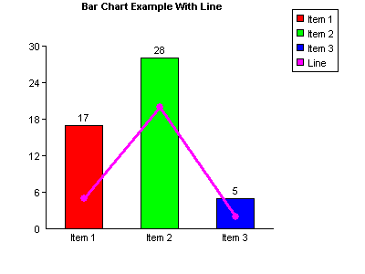
This example uses the same values as the bar chart example in Section 2.
The ShowLinesWithBars property is set to true and AddPoint has been used to add three data points. The X parameter for AddPoint has been set to zero for all three points although any could have been used because it is ignored for this type of graph. The first point is drawn half way along the first bar, the second is drawn half way along the second bar, etc. The maximum number of points that can be drawn for each line is the same as the number of bars. It would be possible to draw another line of three points by calling AddPoint three more times and specifying another colour.
Note that the values of the data points apply to the same y-axis as the bar values. It is not possible to draw a second y-axis with different values.
7. Events
The following mouse events are raised by csXGraph.
OnMouseMove (ShiftState As Long, PixelX As Long, PixelY As Long, GraphX As Double, GraphY As Double, PixelColour As OLE_COLOR) - This event is triggered when the mouse is moved over any part of the control.
OnMouseDown (Button As Long, ShiftState As Long, PixelX As Long, PixelY As Long, GraphX As Double, GraphY As Double, PixelColour As OLE_COLOR) - This event is triggered when a mouse button is pressed over any part of the control.
OnMouseUp (Button As Long, ShiftState As Long, PixelX As Long, PixelY As Long, GraphX As Double, GraphY As Double, PixelColour As OLE_COLOR) - This event is triggered when a mouse button is raised over any part of the control.
Button is an integer which identifies the mouse button that was pressed or released to fire an OnMouseDown or OnMouseUp event. The value of Button corresponds to the values in ShiftState below, i.e., Left = 1, Right = 2, Middle = 4.
ShiftState is an integer which indicates the status of the mouse buttons and the SHIFT, CTRL and ALT keys on the keyboard at the time the event was fired. ShiftState is a bit field where each bit corresponds to a button or key and is set if the button or key is down. The bits are defined as follows:
| Bit no. | Value | Button or Key |
|---|---|---|
| 0 | 1 | Left Mouse Button |
| 1 | 2 | Right Mouse Button |
| 2 | 4 | Middle Mouse Button |
| 3 | 8 | SHIFT Key |
| 4 | 16 | CTRL Key |
| 5 | 32 | ALT Key |
For example, if the left mouse button plus the SHIFT key were pressed, the value of ShiftState would be 9 (=1 + 8).
PixelX and PixelY are the coordinates of the mouse position measured across and down from the top left of the control.
GraphX and GraphY apply to line graphs only and are the coordinates of the point on the graph. These are measured across and up from the graph origin and are floating point values. If the graph is not a line graph these values will be meaningless.
PixelColour is the pixel colour at the mouse coordinates. This can be used to determine whether a certain part of the graph has been clicked because data areas on bar and pie charts and lines on line graphs are specific colours.
OnClick ( ) - This event is triggered when the mouse is clicked on the control.
OnDblClick ( ) - This event is triggered when the mouse is double clicked on the control.
OnClick and OnDblClick do not return any parameters.
8. Installation
csXGraph is supplied as a self extracting zip file and running this will unpack the files and register the OCX. For the full version, the default destination is "C:\Program Files\Chestysoft\csXGraph". For the trial version, the default destination is "C:\Program Files\csXGraphTrial". The files include the OCX files (csXGraph.ocx or csXGraphTrial depending on the version), and the licence files (csXGraph.lic or csXGraphTrial.lic). The licence file is required to use the control at design time in a programming development environment. The trial version is also supplied with a sample Visual Basic project.
Once the files are unpacked it is possible to copy them to another machine and register the OCX manually using regsvr32.exe. The licence file (csXGraph.lic or csXGraphTrial.lic) must also be copied if the control is to be used for development. Note that copying this file might not be permitted by the licence agreement.
From Version 2.0 csXGraph is supplied as both 32 bit and 64 bit and the OCX files are installed to sub folders, "x86" and "x64". When it is installed on a 64 bit operating system both OCX files will be registered. They have the same name and class ID but they are registered in separate parts of the registry and the control used will depend on whether the calling application is 32 bit or 64 bit. The AboutBox and Version property will indicate whether the control running is 32 bit or 64 bit.
Chestysoft have a DLL/OCX registration tool that can be downloaded for free at: https://www.chestysoft.com/dllregsvr/default.asp
8.1. Using csXGraph in Visual Basic
The csXGraph control is added to a Visual Basic project by selecting Components from the Project menu. A list of available controls will be shown and the box must be ticked for "csXGraph Library", or "csXGraphTrial Library" for the trial version. Click the Apply button and the control icon will appear on the ToolBox. The control can then be dragged on to a form in the same way as any other control.
These instructions show examples using Visual Basic so there should be no need to mention specific syntax requirements. We should point out that in Visual Basic the method calls do not use brackets. A property with an input parameter, such as BinData, does require brackets.
The trial version of csXGraph is supplied with a Visual Basic project for demonstration purposes. This should clarify the syntax of the commands needed to generate different types of graph.
8.2. Using csXGraph in Delphi
The steps to adding the csXGraph control to the component palette is to first create a new package, through the File menu and then adding the component to this package using Component, Import Component, Import ActiveX Control. Select either "csXGraph Library" or "csXGraphTrial Library" from the list and then click the Install button. Options then allow the component to be added to the current package or to create a new package. Once this package is built, the control will be added to the ActiveX tab on the component palette and it can be added to a form like any other component.
8.3. Using csXGraph in VB.NET
The csXGraph control is a COM object, but it can still be used in .NET applications. To import it for use in Visual Basic.NET select Customize Toolbox from the Tools menu. The COM Components tab will be showing to list the available objects. Select "csXGraph Control" or "csXGraphTrial Control" from this list and the csXGraph icon will appear in the Toolbox in the Components section. Dragging a copy of the control onto a form will automatically produce an Interop Assembly and add this to the references of the project.
The data types used by COM are not exactly the same as those used by .NET and with csXGraph these differences affect the use of colours and fonts. The methods that use OLE_COLOR as a parameter, such as AddData and AddPoint, will use a UInt32 instead, for example:
AxDraw1.AddData("Item 1", 14, System.UInt32.Parse(&HFF))
This converts the hexadecimal value FF into a UInt32 value to give the colour red.
Properties representing colours use the data type System.Drawing.Color, for example:
If CheckBox3.CheckState Then
.PlotAreaColor = System.Drawing.Color.FromArgb(&HEEEEEE)
Else
.PlotAreaColor = System.Drawing.Color.White
End If
This sets the PlotAreaColor property to either a light grey or white depending on a check box state.
The individual font properties cannot be set directly in .NET because they are read only. When a font needs changing from its default settings all the properties must be specified using the New command, for example:
AxDraw1.TitleFont = New Font("Arial", 10, FontStyle.Bold)
8.4. Events in VB.NET
The code used for an event handler in VB.NET uses different parameters from those described in these instructions. The parameters returned by the event are returned as sub properties of the object "e"
Private Sub AxDraw1_OnMouseMove(ByVal sender As System.Object, ByVal e As AxcsXGraph.IcsXGraphEvents_OnMouseMoveEvent)
Handles AxDraw1.OnMouseMove
Label1.Text = e.pixelX
End Sub
This code would write the x-coordinate of the mouse to Label1 as the mouse is moved.
There is a VB.NET example project available for download from our web site at: https://www.chestysoft.com/xgraph/vbnetdemo.asp
8.5. Replacing the trial with the full version in VB.NET
In most development environments it is quite straightforward to delete the trial version of csXGraph and replace it with the full version while keeping the same name for the object instance. In .NET, first delete the trial control from the form and then delete the references to the Interop Assemblies from within the project properties. Then the new control can be added to the form and new references will be automatically generated. Our example project uses enumerated properties of the control and for these each instance of csXGraphTrial must be replaced with csXGraph.
8.6. Deploying a Compiled Application
Once an application is compiled and ready to deploy, an installation package is usually created which will take care of copying the files onto the target computer and registering the OCX. Most programming development environments are supplied with some sort of deployment tool. For example, Visual Basic has the Package and Deployment Wizard. There are also many third party installation tools available. The file "csXGraph.ocx" must be added to the package with the relevant instructions to register the control. The licence file "csXGraph.lic" must not be added to the package because it cannot be freely distributed, and it is not required with a compiled application.
With the trial version, the OCX file name is "csXGraphTrial.ocx" and we would recommend that you verify how to deploy the trial version before proceeding to upgrade to the full version.
When testing the installation package it is advisable to use a computer that does not have the csXGraph control already installed. Otherwise it is not testing whether registration was successful. Also, if the installation package is run on the development machine it could register a new copy of the control and make the licence file unavailable for design use. The VB Package and Deployment Wizard does this and if it must be run on the development machine, csXGraph should be uninstalled first and reinstalled later.
It is possible to copy the OCX file to the target machine manually and register it using regsvr32.exe or our own registration utility.
9. Using csXGraph Client Side in a Browser
csXGraph can be used in a browser as a client side control using Javascript or VBScript. For users of the full version of the control (not the trial version), a signed CAB file is available for this purpose. Note that csXGraph is an ActiveX control and so it requires a Windows platform and will only run in Internet Explorer browsers.
Most versions of Internet Explorer in use are 32 bit, so the 32 bit version of csXGraph should be used.
9.1. The Licence File
csXGraph is a licensed control. It is priced by the number of design time licences required, and that means the number of copies needed of the file csXGraph.lic (csXGraphTrial.lic for the trial version). When using the control in a web browser, an alternative way of distributing the licence information must be used so that each client machine can use the licence present on the server. This is done by creating a Licence Package File which allows the licensed copy of the control to be placed on the server but an unlimited number of users can connect to the server and use the control without requiring their own licence.
A Licence Package File is supplied with the installer and it will be in the same folder as the csXGraph control. This can be copied to the server, or a .lpk file can be generated on the server although the Microsoft tool for doing this has been discontinued.
The following HTML is used to call up the .lpk file:
<object classid="clsid:5220cb21-c88d-11cf-b347-00aa00a28331"><param name="LPKPath" value="csxgraph.lpk"></object>
This class ID is used for all .lpk files. The name shown in the VALUE attribute is the name used when creating the .lpk file. This attribute can accept a relative path. It is possible to include the licence information for several OCX controls in the same .lpk file.
9.2. Distributing the OCX File
The client computer will need a copy of the OCX control in order to run an application using it. For a small number of clients it would be feasible to copy and register the .ocx file onto each machine. This file is csXGraph.ocx (csXGraphTrial.ocx for the trial version). The .ocx file can be distributed royalty free providing the .lic file is not distributed.
The control can be downloaded the first time the client accesses the page that uses it. To do this the .ocx file can be included in the CODEBASE attribute of the OBJECT tag. The .ocx file can be packaged into a CAB file first which reduces the size to approximately one half. We provide a digitally signed CAB file with the full version, but not with the trial version.
9.3. Calling the Control
The following HTML is used to call up the control. First for the trial version:
<object id="Graph1" classid="clsid:6C14B5B4-8A97-475B-A8D7-55D9275B2C55" codebase="csxgraphtrial.ocx"></object>
Then for the full version:
<object id="Graph1" classid="clsid:C68A2D73-03C7-4436-934C-2E42DA50B6E7" codebase="csxgraph.cab"></object>
The object name is specified in the ID attribute. This can be any name and it will be used to call properties and methods of the object. The path to the .ocx or .cab file is specified in the CODEBASE attribute.
9.4. Security Settings in Internet Explorer
Internet Explorer has security settings that may restrict the use of ActiveX controls. These settings can be accessed by selecting Internet Options from the menu, then selecting the Security tab and clicking on the Custom Level button. The security level can be set to "Enable", "Disable" or "Prompt". If the "Disable" option is selected, the control will not be able to run. It should be noted that there are separate settings for Signed and Unsigned ActiveX controls, so different behaviour may be seen between the trial version of the control and the digitally signed CAB file of the full version.
9.5. Javascript Example
We have an example on our web site showing the use of csXGraph as a client side control. This example uses the trial version so it is unsigned and may generate security warnings in your browser. Here is the URL of the example:
https://demo.chestysoft.com/ocx/csxgraphtrial.htm
The file is not available as a download but it can be saved from the browser or the source code can be viewed by right clicking.
9.6. Events in Javascript
The events exported by csXGraph must be declared when the page first loads. This is done inside the Javascript window.onload event handler. Here is an example of defining a Javascript function that will run when the onMouseDown event fires.
window.onload = function() {
var onMouseDownEvent = document.getElementById("Graph1");
onMouseDownEvent.attachEvent("onMouseDown", csXGMouseDown);
//other JavaScript code could be put here to run on page loading
}
function csXGMouseDown(Button, ShiftState, PixelX, PixelY, GraphX, GraphY, PixelColour) {
//this code runs when the mouse down event fires
//the parameters Button, ShiftState, PixelX, PixelY, GraphX,
//GraphY and PixelColour are defined in the ActiveX event
}
First, the element ID is extracted. This is the ID used in the object tag when the ActiveX object is created. In the previous code example we used "Graph1". The attachEvent method is then used to attach the OnMouseDown event to a function. A function can then be defined, using the same parameters as the event exported by the csXGraph control.
9.6.1. The older method of defining Javascript events
There is an older method of defining ActiveX events in Javascript and, although it works, it uses code which is not supported by XHTML and it will not validate. The event is declared inside a script tag, for example:
<script language="JavaScript" For="Graph1" event="onMouseUp(Button, ShiftState, PixelX, PixelY, GraphX,
GraphY, PixelColour)">
alert('X: ' + GraphX + ', Y: ' + GraphY)
</script>
The FOR attribute specifies the name of the object variable, in this case "Graph1". The EVENT attribute specifies the event name and the parameters returned, if any. The code to execute is placed inside the tag and this may include a call to another function in another part of the script. This example shows how the onMouseUp event can be used to return the X and Y coordinates from a line graph.
10. System Requirements
csXGraph version 2.0 requires Windows XP or later to run. Support for the earlier Windows operating systems, 95, 98, 2000, NT and ME has now been withdrawn and the control will not register on these systems. We can provide the previous version of csXGraph on request but it will not include any features that have been added to version 2.0.
csXGraph is now supplied as two ocx files, one is 32 bit and the other is 64 bit. Our installer registers both, if the system allows this, and they both have the same file names, class names and class IDs. The calling application will use the appropriate control. For example, Visual Basic 6 is a 32 bit application and it will call the 32 bit version of csXGraph. Visual Studio for .NET can use either unless the compile options are set for a specific CPU. The Visual Studio IDE is 32 bit and so the 32 bit version of csXGraph will be running at design time.
11. Revision History
The current version of csXGraph is 2.0
New in Version 1.1
Text can be added to line graphs using data coordinates.
ShowPlotBorder property added.
HideHGrid and HideVGrid added.
Events added for mouse actions.
New in Version 1.2
Unicode character support added.
Compressed GIFs now supported.
PictureData property added for use with MS Access.
Improvements to line graph text.
New in Version 1.3
Stacked bar charts.
New in Version 1.4
Signed CAB file supplied with the full version.
New instructions.
New in Version 1.5
Trend lines on bar charts.
Read only properties providing information about a plotted graph.
New in Version 1.6
Optional plotted points and lines in bar charts.
New in Version 2.0
64 bit version released.
CustomLegend option added.
12. Other Products From Chestysoft
ActiveX Controls
csXImage - An ActiveX control to display, edit and scan images.
ASP Components
csImageFile - Resize and edit JPG, BMP, GIF, PNG, PCX, PSD, TIF and WBMP images.
csImageLite - A cut-down version of csImageFile for resizing and merging images.
csDrawGraph - Draw pie charts, bar charts and line graphs in ASP.
csASPUpload - Process file uploads through a browser.
csASPGif - Create and edit animated GIFs.
csIniFile - Read and Edit Windows style inifiles.
csASPZipFile - Create zip files and control binary file downloads.
csFileDownload - Control file downloads with an ASP script.
csFTPQuick - ASP component to transfer files using FTP.
13. Alphabetical List of Commands
Click on one of the links below to go directly to information about that command:
- AboutBox
- AddCursor
- AddCustomLegend
- AddData (Bar Charts)
- AddData (Pie Charts)
- AddExtraLine
- AddGroupedData
- AddLineGraphText
- AddPoint
- AddText
- AddXValue
- AddYValue
- AxisTextBGColor
- AxisTextColor
- AxisTextFont
- AxisTextTransparent
- BarGap
- BarTotalVertical
- BarWidth
- BGColor
- BinData
- BMPHandle
- CenterX
- CenterY
- ClearAxisLabels
- ClearCustomLegend
- ClearData
- ClearImage
- CopyToClipboard
- Cursor
- CustomLegend
- DateFormatString
- DateTimeFormat
- Decimals
- DrawGraph
- FirstBarPos
- GraphPen
- GraphType
- GridColor
- GridStyle
- Height
- HideHGrid
- HideVGrid
- JpegQuality
- LabelBGColor
- LabelColor
- LabelFont
- LabelTransparent
- LabelVertical
- LastBarPos
- LegendAlign
- LegendBGColor
- LegendColor
- LegendFont
- LegendInvert
- LegendHideEmptyNames
- LegendVertical
- LegendX
- LegendY
- LineGraphBorderColor
- LineGraphLeaderColor
- LineGraphTextAlign
- LineGraphTextBGColor
- LineGraphTextBorder
- LineGraphTextColor
- LineGraphTextFont
- LineGraphTextLeader
- LineGraphTextTransparent
- LineGraphTextX
- LineGraphTextY
- LineWidth
- MaxX
- MaxY
- Offset
- OnClick
- OnDblClick
- OnMouseDown
- OnMouseMove
- OnMouseUp
- OriginX
- OriginY
- Padding
- Picture
- PictureData
- PieDia
- PlotAreaColor
- PointSize
- PointStyle
- Prefix
- PrefixX
- PrefixY
- ReadBarGap
- ReadBarWidth
- ReadXGrad
- ReadXTop
- ReadYGrad
- ReadYTop
- RNDColor
- SaveToFile
- ShowBarTotal
- ShowGrid
- ShowLabel
- ShowLegend
- ShowLegendBox
- ShowLine
- ShowLinesWithBars
- ShowNumbers
- ShowPercent
- ShowPlotBorder
- ShowSeparator
- ShowSeparatorX
- ShowSeparatorY
- ShowStackedValue
- ShowTotalIfZero
- ShowTrendLine
- Square
- StackedTextAlign
- StackedTextBGColor
- StackedTextColor
- StackedTextFont
- StackedTextTransparent
- StartAngle
- Suffix
- SuffixX
- SuffixY
- TextBGColor
- TextColor
- TextFont
- TextTransparent
- TimeFormatString
- Title
- TitleBGColor
- TitleColor
- TitleFont
- TitleTextAlign
- TitleTransparent
- TitleX
- TitleY
- TransColor
- Transparent
- TrendLineColor
- TrendLineName
- TrendLineName
- UseRNDColor
- UseXAxisDates
- UseXAxisLabels
- UseYAxisDates
- UseYAxisLabels
- Width
- XAxisNegative
- XAxisText
- XGrad
- XMarkSize
- XOffset
- XPixelsPerUnit
- XTop
- XValuesVertical
- YAxisNegative
- YAxisText
- YGrad
- YMarkSize
- YOffset
- YPixelsPerUnit
- YTop